저번에 했던 Media Queries 는 브라우져의 크기에 따른 CSS변화를 가져다 주는 태그였다면 이번의 viewport는 휴대용 기기에만 해당하는 태그라 할수 있습니다. (실제 일반 PC용 브라우져에선 viewport 는 무시됩니다)
viewport 가 설정되지 않은 페이지를 보면 일반 PC브라우저에서 보는 크기와 똑같은 크기로 휴대용기기에서 나오는것을 볼수 있습니다. 물론 확대가 되기 때문에 문제는 없겠지만, 사용자는 자신에게 딱 맞는것을 봐야 기분이 좋겠쬬. (웹 페이지 공부하면서 매일 보는 싸이트입니다. 다양한 페이지 UI가 있어서 공부하기엔 좋은거 같습니다. 근데 정말 작게 나오죠?!)
그럼 이제 viewport 적용 방법을 보시겠습니다.
아주~~ 간단합니다.
<head>태그 아래에 다음과 같이 써주면 됩니다.
<meta name="viewport" content="height=device-height, initial-scale=0.1,
minimum-scale=0.1, maximum-scale=10.0, user-scalable=yes"/>
속성이 다섯개가 있는데 속성들은 다음과 같이 정의된다.
viewport
Changes the logical window size used when displaying a page on iOS.
Property
| Description
|
width
|
The width of the viewport in pixels. The default is 980. The range is from 200 to 10,000.
You can also set this property to the constants described in “number.”
Available in iOS 1.0 and later.
|
height
|
The height of the viewport in pixels. The default is calculated based on the value of the width property and the aspect ratio of the device. The range is from 223 to 10,000 pixels.
You can also set this property to the constants described in “number.”
Available in iOS 1.0 and later.
|
initial-scale
|
The initial scale of the viewport as a multiplier. The default is calculated to fit the webpage in the visible area. The range is determined by the minimum-scale and maximum-scale properties.
You can set only the initial scale of the viewport—the scale of the viewport the first time the webpage is displayed. Thereafter, the user can zoom in and out unless you set user-scalable to no. Zooming by the user is also limited by the minimum-scale and maximum-scale properties.
Available in iOS 1.0 and later.
|
minimum-scale
|
Specifies the minimum scale value of the viewport. The default is 0.25. The range is from >0 to 10.0.
Available in iOS 1.0 and later.
|
maximum-scale
|
Specifies the maximum scale value of the viewport. The default is 1.6. The range is from >0 to 10.0.
Available in iOS 1.0 and later.
|
user-scalable
|
Determines whether or not the user can zoom in and out—whether or not the user can change the scale of the viewport. Set to yes to allow scaling and no to disallow scaling. The default is yes.
Setting user-scalable to no also prevents a webpage from scrolling when entering text in an input field.
Available in iOS 1.0 and later.
|
하나한 자세히 살펴 보면은 content 는 기준이 되는 길이를 정하는 것이다. 속성값에는 device-width, device-height 두가지가 있다. 기준이 가로, 세로로 기존의 웹앱은 가로에 자동으로 맞추어져 있는데 이것을 세로로 바꿔서 해보면
<meta name="viewport" content="height=device-height, initial-scale=0.1,
minimum-scale=0.1, maximum-scale=10.0, user-scalable=yes"/>
세로일때는 이상이 없어보이지만 가로로 뉘여보면
세로에 픽스하게 만들었기 때문에 가로로 했을경우 옆부분이 짤리는 경우를 볼수 있다.
initial-scale 의 속성값은 처음 시작할때의 스케일 크기이다.
minimum-scale 는 최소 스케일 크기(0~10)
maximum-scale 는 최대 스케일 크기를 나타낸다.(0~10)
user-scalable 는 사용자가 확대 축소를 허용할것인가이다.
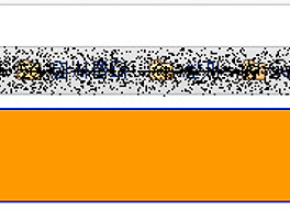
일단 user-scalable를 yes로 두고 min, max 를 테스트 해보면
(min 을 0.1, max를 10으로 두었다.)
1.처음 화면
2. 확대한 모습(아마도 10배 확대가 되었겠죠?)
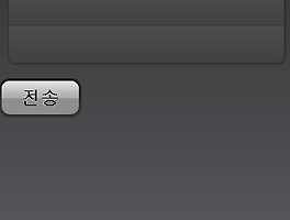
- 사실 jQTouch 를 import 하면 딱히 설정할 필요가 없습니다. viewport는 알아서 잡아주거든요.;
- 그냥 공부차원에서 해봤습니다;; 보시면 알겠지만 JQTouch 에서는 확대 축소를 허락하지 않는거 같습니다.;; 아무리 해도 않되더라고요. 그래서 지우고 해서 모양이 저 모양이 되어 버렸네요.